15 Dental Website Design Tricks That Book 150% More New Patients (Each Month)
I think you’ll agree with me that knowing how to improve your dental website design in 2019 is hard. Especially with the goal of more new patient bookings.
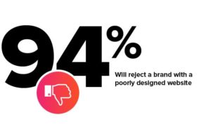
In fact, a recent study found that 94% of people reject or mistrust a website/brand due to its web design.
But does it have to be hard?
Today, I’ll be showing you 15 dental website design tricks that will book 150% more new patients (each month!).
Not only will I cover each technique in detail, but I’ll be breaking down the reasons they work so great. These tips come from researching, testing, and analyzing hundreds of the best dental websites in 2019.
Ready for my favorite part?
I’ll be sharing LOTS of real-life examples (and case studies) of these website design tactics in action.
Let’s dive right in…
Want to jump right into the case studies?
Here are 5 real-life case studies from dentists who upgraded their website for better design and haven’t looked back since (their awesome results speak for themselves):
- Aesthetica Contemporary Dentistry
- Manchester Advanced Dental
- Jeannine E Wyke, DMD
- Silberman Dental Group
- Orthodontic Specialists – Indian Valley
1. Make your UVP (Unique Value Proposition) clear
Before writing this piece, I reached out to our Creative Director (Charlie Wells) for her insights on this topic and she said something so simple, yet so profound, I just had to share it:

“Your website may be the first contact with a potential patient. Why should a new patient choose your practice? The answer should be clear from the moment a patient visits your website.”
Think of your website as your opportunity to personally introduce yourself to EVERY potential new patient. What are you going to say?
Let’s face it.
If you are only using that opportunity simply to tell them that you are a “general dentist in Houston, Texas” you will lose out.
Why?
Because guess what…
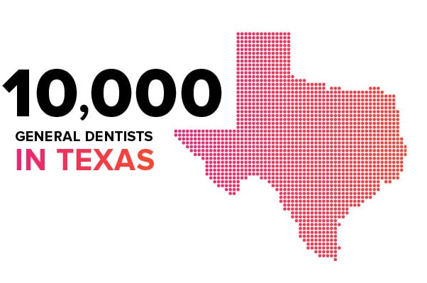
… there are over 10,000 general dentists in Texas alone. They ALL do that.
So with all this competition… what makes YOU stand out?
Your Unique Value Proposition.
In other words, your ability to showcase (on your website) the very thing, approach, or reason why anyone should choose YOU over your competition.
Let’s look at a great example:
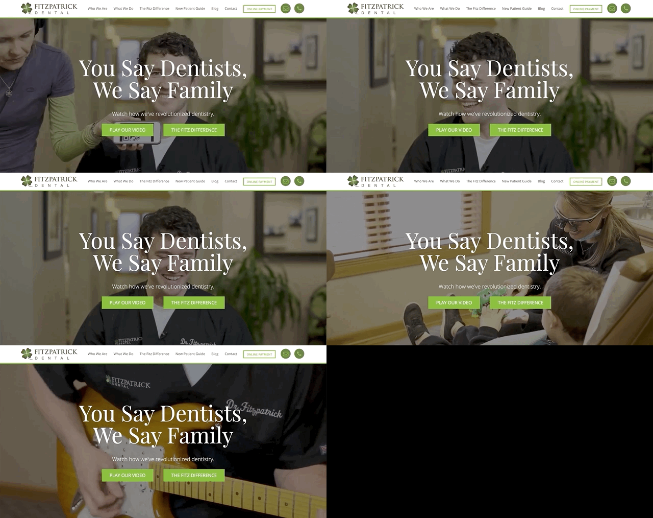
Fitzpatrick Dental is an outstanding example of great UVP in action. From the moment you land on their website you instantly do 2 things:
- Fall in love with them.
- Understand what they are about. (Creating a fun, family environment)
Ready for one of my favorite things about this site? The background video is a blooper reel! Complete with Dr. Fitz laughing and riffing on his guitar.
So what were his results?
Well, they speak for themselves:
See his full case study here.
Mobile Traffic Increase
Page View Increase
Session Increase
2. Only use responsive dental website design
Responsive website design is likely something you all have heard of time and time again. Quite frankly, if you currently do NOT have a responsive website….
… stop reading, and go build one before you bother reading the remaining tips.
Why?
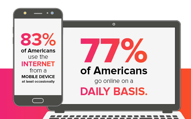
Simply because over 83% of Americans who use the internet do so from a mobile device. Think about that. If your website is not optimized around users on other devices, you are leaving money on the table.
For those of you not familiar with responsive dental websites, here it is in a nutshell:
Responsive website design is an approach to developing a website that responds to the user’s behavior and environment based on screen size, platform, and orientation.
This is especially important with Google’s indexing change in March, where they announced that Google will crawl and index websites from the perspective of a mobile user instead of a desktop user.
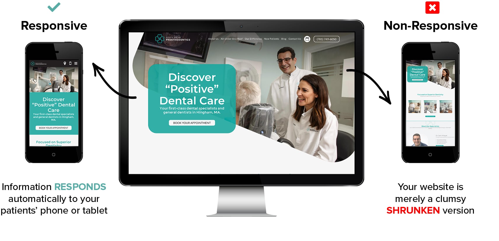
So what happens when you have a bad mobile experience? Your rankings (and new bookings) are going to drop like someone is swimming ? with an anchor ⚓ for a belt. So once you’ve got a responsive design, let’s talk about the more nitty-gritty.
3. Organize your dental website design hierarchy
Here’s the truth: Bad website hierarchy will cause you to lose website visitors and absolutely lose potential patients.

“Things need to work intuitively so that users can find the information they need, period. “Organize things so that there is a hierarchy. You want your readers to be able to both scan headlines AND delve into more in-depth information when there is a subject that truly interests them.”
Whenever we at Roadside Dental Marketing begin a dental website design project, there a few things we always ensure are done correctly. Proper overall website architecture (organization of all the pages), as well as page-specific hierarchy (the layout and organization of the content on each webpage).

If you thought people didn’t like going to the dentist before, just wait until you see how they react to a poorly designed dental website. In today’s digital age, if your website’s content is not well organized and easily consumable, people are going to leave your site faster than if it was on fire ?.
In fact, Crazy Egg (an online tool that specializes in tracking how website visitors interact with websites) found that on average, users spend less than 15 seconds on a webpage if it doesn’t immediately capture their interest.
15 seconds!
That is all you have to capture the attention of your website visitors.
It’s crucial then, that you utilize proper website hierarchy to capture and retain your new patients online.
4. Always create an About Us/Meet the Doctor page
When it comes to marketing your dental website online, there tend to be more challenges than the average business might face. Every dentist knows that patients aren’t exactly lining up every morning like children at a candy store.
Dentistry requires a slightly different approach to online marketing because two things are more important than anything else when it comes to marketing in the healthcare industry:
Expertise & trust
This is crucial to your success online. This principle can actually be applied to your entire website, but for the sake of this discussion, let’s focus on just the Meet the Doctor page.
The About Us or Meet the Doctor page is the second most visited webpage on your entire site.
Why is this important?
This is your opportunity to connect with your potential new patients. The about page is where any patient should be able to clearly see your expertise and build trust in you.
Pro Tips:
- Clearly explain why you became a dentist.
- Display a high-quality headshot – people are less likely to trust those they can’t see.
- Showcase your experience and education.
- Ensure your “above-the-fold” content is clear, concise and important.
- Include at least one call to action on the page.
Ready to see a great example?
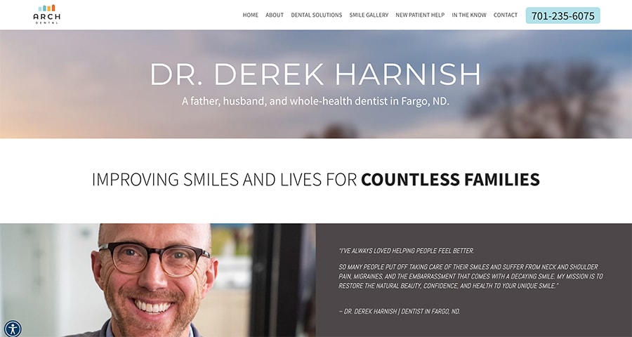
Arch Dental’s About Us page is not only clean and concise but it showcases who Dr. Harnish is and what he is about.
In a matter of seconds, you learn that he is family-oriented, helpful, dedicated to his work, and you even learn the reason he enjoys being a dentist.
5. Keep your content fresh & up to date
Another of our dental website design tricks is related to fresh quality content. Aside from the many SEO benefits to fresh, up-to-date content, there are substantial reasons that content maintenance is a necessity in 2019.
Reason 1 – It helps avoid losing their trust.
As mentioned in tip 4, trust is HUGE. When a website user sees your webpage with dates from 2013 or specials that have expired, they begin to wonder if you are even still in business, or practicing in their area.
Reason 2 – It creates a better experience for your patients.
When the content of a website is not updated periodically, it can lead to an awful user experience. Outdated content leads to incorrect information, broken links, wrong phone numbers, or even doctors that are no longer practicing.
When users see or experience these things, they decide that you no longer care about your practice, and neither should they.
Reason 3 – It drives more traffic to your website.
As was mentioned above, Google hates bad user experiences. If Google displays your website, and users hate the result, then they may not use Google again.
Google can’t have this.
So they ensure that the websites that create the best experience for searchers are ranked at the top.
6. Dazzle your patients with multimedia
Text content can only take your dental website so far. To take your dental website design to the next level, you have to include engaging images, videos, and graphics that capture your patient’s attention and keep it.
I mean, take a look at this article for example.
Do you notice the number of screenshots, graphics, and images I use? It was no mistake. I firmly believe that it takes my blogs to the next level. The same is true for any page on your website.
Here is one of my favorite before and afters to showcase this in action:
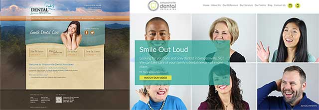
This practice’s use of multimedia not only engages the visitor, but it quickly evokes emotion about the practice. The smiling faces used in the hero area make a person feel good about the brand before they even begin to learn more.
Here is another great example of multimedia at work:
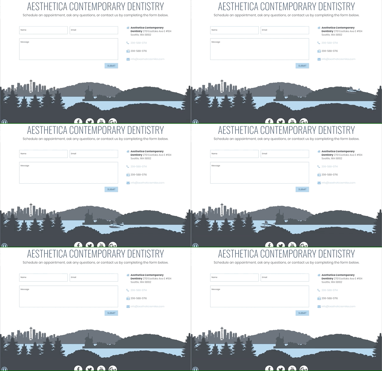
As you can see, Aesthetica’s modern design coupled with interactive elements makes for a very engaging contact form, something that not only helps them get compliments but more patients.
7. Speed up your website’s load time
This may not exactly qualify as a “dental website design tip,” however, it no doubt is crucial to the website design project.
Why is it so crucial?
Because a long load time on a website WILL affect conversions. How would you feel if you spent countless hours and thousands of dollars on your beautiful new website only to have it completely fail due to its speed?
A 1-second website load delay on Amazon would cost $1.6 billion in sales.
An extra 0.5% load time on search pages would cause traffic to drop by 20% for Google.
Yahoo says a 0.4 second increase improves traffic by 9%.
Firefox reduced load time by 2.2 seconds and had a 15.4% increase in downloads.
Huge brands know the importance of this. Amazon has gone as far as to claim that a 1-second delay on their website could cost them $1.6 billion in sales.
Let’s not get confused though, I know you are not Amazon. That being said, the data speaks for itself.
Slow websites = less patients.
For a free dental website analysis (including a speed test) with recommended improvements, click here:
8. Design your dental site for conversion optimization
I know what you might be thinking. What does design have to do with conversion? Data shows that whether or not your website is aesthetically pleasing becomes a big factor when converting potential patients into actual bookings.
So what exactly can you do to design that improves conversion?
Here are 3 dental website conversion tips to start:
Lesson 1 – Utilize Hick’s Law.
For those unfamiliar the law states:
“The time it takes for an individual to make a decision is directly proportionate to the possible choices he or she has available.”

The Takeaway: Limit the number of CTA’s (calls to action), buttons, or links packed in one space.
Lesson 2 – Keep it simple.
Although this aligns with the lesson about Hick’s Law, more comes into play than just limiting options. There’s a reason we hear, “Well… I really like Apple’s website” when new clients are in the design phase of their website project.
Because it looks amazing.
Apple is well known for their sleek designs and simplistic look. Their design is so admired because clean web design is uncluttered and minimizes distractions.
The Takeaway: Make your designs clean and guide your patients toward the goal of the page (request an appointment, leave a review… etc).
Lesson #3 – Don’t underestimate the use of color.
Color and branding (which we will cover next) go hand in hand. The “first impression” or the way a patient feels about your practice can be directly related to your overall branding and color scheme.
This is because colors evoke emotion.
When you see this dental practice’s website, how do you feel?
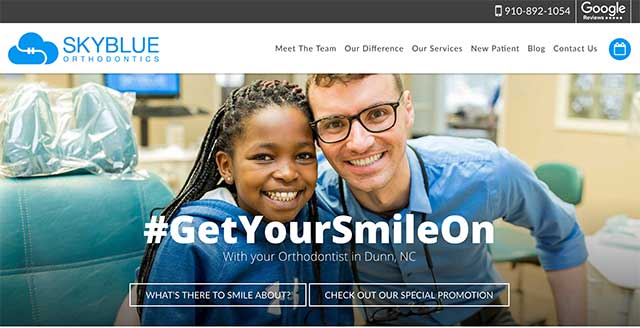
What are your initial feelings about the practice? The doctor? Most would say “trusting,” “inviting,” ”calm,” or “friendly.” This was no mistake; it was by design.
The blue in the logo, both the words “sky and blue,” along with the color of their shirts all help to guide your emotional decision about this practice towards feelings of trust.
It’s the same reason you see the color blue in the logo of many banks or even of popular social media apps like Facebook and Twitter.
With that thought in mind, let’s dive into our next design trick.
9. Understand the importance of dental branding
As we have already discussed, dental branding is extremely important. A brand and reputation is what sets you apart from every other dentist in your area.
Here are 3 branding facts often overlooked regarding branding:
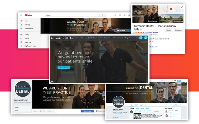
Fact 1: A branded practice will be worth more than a non-branded practice
A branded practice will often do far better economically than a non-branded practice. That is a fact. Additionally, when it’s time to sell, a practice with a great reputation and proven ongoing marketing systems will command a better price than a run-of-the-mill practice.
Fact 2: You can attract more of the cases you want through branding
Savvy dentists don’t try to recruit everyone to their practices. Instead, they target the patients and cases they want (e.g., cosmetically oriented patients, seniors, parents of orthodontic-aged kids, TMD cases, soccer moms, nurses, teachers, etc.). Branding can help you appeal to exactly the audience you want.
Fact 3: People refer more often and more passionately to a brand they like and trust
Truly great brands achieve near cult-level loyalty from their followers, to the point where consumers actually identify with their brands.
Think about the loyalty regarding brands like Apple, Starbucks, Harley Davidson, or the long debate on Coke vs Pepsi. Obviously, those are VERY different industries.
However, there is one HUGE takeaway:
“Customers (or in this case patients) reward great ‘brand experience’ with wholehearted loyalty.”
For a dentist, 90% of this loyalty is built in-office, chairside. However, the results of that loyalty flow online, everywhere they see your brand. Which leads to more new patients.
A loyal patient sees your Facebook post? They like it, comment, or share.
They see you have a referral program? They participate.
They see your name pop up in Google? They leave a 5-star review.
Let me ask you… What’s often a dentist’s #1 method for gaining new patients?
Word-of-mouth referrals.
So how does that translate online? Let’s cover that in our next trick.
10. Add testimonials and social proof
Word-of-mouth referrals are one of the most successful methods for a dentist’s getting new patients. There’s no question about it. Did you know that the same is true for online reviews?
In fact, nearly 88% of people trust online reviews as much as a friend’s recommendation. People rely on online reviews in shopping and choosing healthcare services.
of consumers will search the internet for online reviews
of people trust online reviews as much as a recommendation from a friend
of people look more often for reviews about a business than for discounts
Any dental website worth its salt should absolutely have testimonials and social proof as a mandatory section of the page.
Pro Tip: Don’t make a Testimonials Page, as they are often very low-traffic pages.
Instead, pepper your amazing reviews all throughout each relevant page on your website. If you are currently struggling to get new reviews from patients, we have a free resource that will help:
Because everyone doing business online will eventually get a bad review...
When it happens, this emergency preparedness eBook can help you:
- Turn a negative review into an opportunity to increase patient conversions.
- Add credibility to your positive reviews.
- Endear potential patients to your practice.
- Give your practice a chance to show how awesome it really is!
11. Avoid rotating sliders or carousels with text!
I know some people “love the look” and a few website themes force you to have it, but please, when it comes to sliders and carousels….
… Avoid! Avoid! Avoid!

I say it three times because I mean it. I know many designers that love the look of them and want to use them, but our own studies, as well as many other sources, show that website sliders simply don’t work anymore (when done incorrectly).
They tend to cause issues on mobile devices, they push down some of your most important content and only about 1% of people actually click on them!
Now there are some ways to properly use a website slider. Even some of the sites we design occasionally have them:
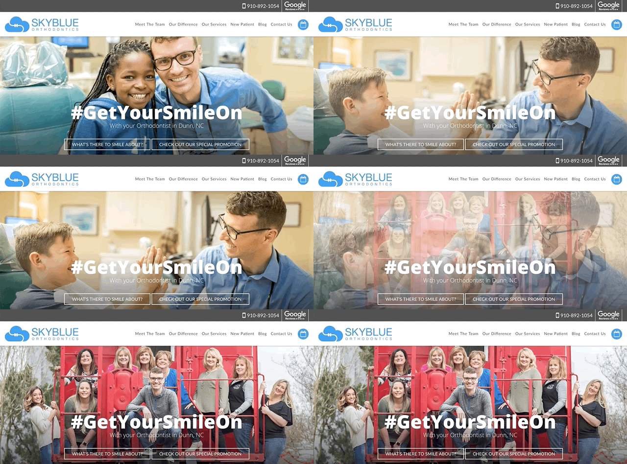
If you MUST use a slider or carousel on your webpage, follow these best practices:
- Don’t add any text on the sliders
- Don’t make your sliders clickable
- Put your most important image on the first slide (it’s often the only one ever seen)
If you’re serious about creating a patient booking machine, I suggest using a static image, collage, or grid instead.
12. Diversify your CTA (call to action) placement
Many of you are already aware that you should place your calls to action above the fold.
The reason for this is simple. It draws your user’s attention to your CTA as soon as they land on the page.
Ready for the twist?
Do NOT stop there. It’s true that above-the-fold content often converts better and more often, but one study analyzed 25 million website visits and found that most engagements happen below the fold.
So do we learn from this?
Diversify!
Place your CTAs in any place that might have high areas of interest.
Here is a beautiful example:
Example: This Orthodontics office utilizes CTAs in numerous places throughout their homepage.
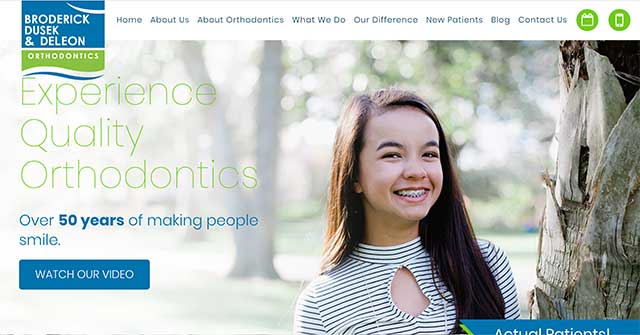
As soon as you land on the page, the CTA “Watch Our Video” tries to engage the visitor with content that begins to build trust with the practice.
Then as you scroll…
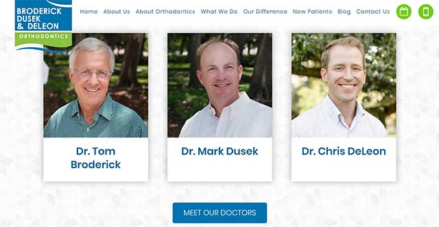
Now you get to meet some of the doctors. What’s the goal here? Get them to the Meet the Doctors page so they can learn and see the faces behind the practice.
Then if you skip all the way towards the bottom of their page:
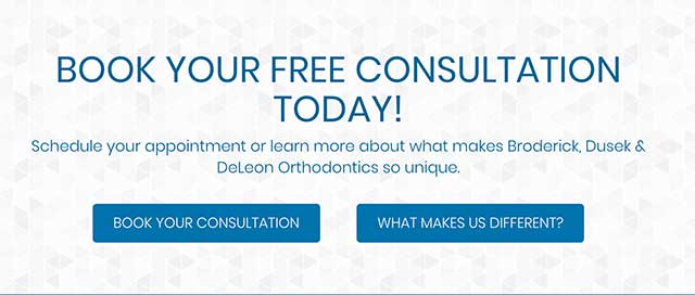
There are two clear CTAs giving them 1 of 2 options:
- Book an appointment
- Keep learning about the practice
When we better design our website for conversions, we get more of what we actually care about…
…more patients!
13. Control your users’ attention with “visual cues”
Personally, this is my favorite website design approach EVER. I love it because I am fascinated with the psychology behind marketing and the power of suggestion.
The reality is, good website design can actually control your attention the same way magicians do: With visual cues. So without further ado…
Here are 2 “visual design cues” to direct your visitors’ attention:
Cue 1: The use of arrows as a visual path director.
Take a look at these two examples:

Now, take a look at what arrow visual cues does for the design:
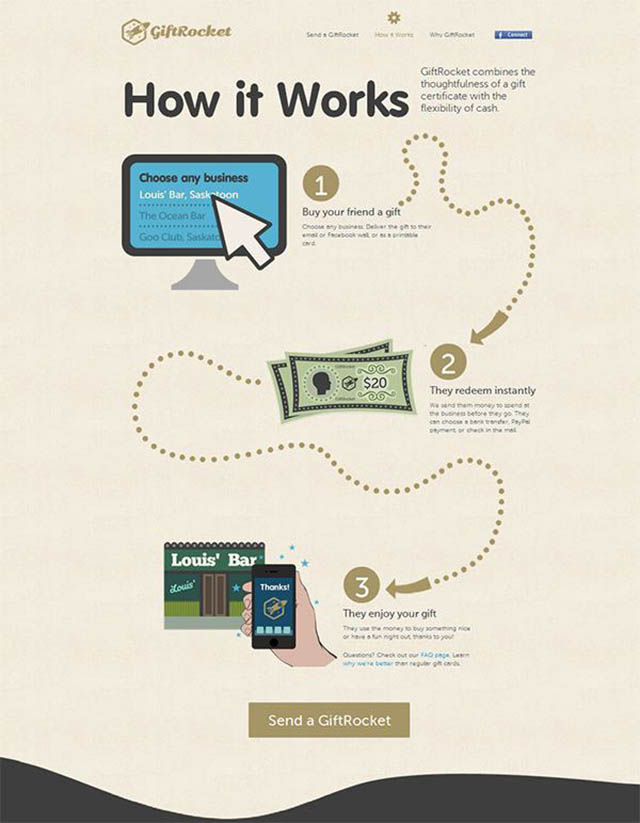
Which of these images stand out to you? No doubt it’s image #2.
Why is this? The use of arrows easily takes your eyes exactly where they want them to go…
…the purchase button.
Cue 2: Line-of-sight visual cues.
Magicians often can guide your attention by looking where they want YOU to look. This is so effective because humans naturally mirror each other’s behavior. This is also true online:
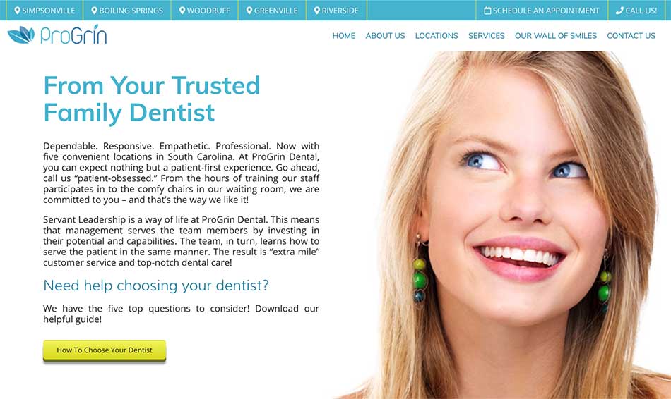
When we see other people looking at something, our natural inclination is to follow their eyes. So how do we use this to our advantage?
It’s simple: Make sure you utilize images of people so they look where you want your visitors’ attention to be.
Pro Tip: Use this sparingly. Please don’t add five images of people all looking at different buttons or forms on your website. As with anything, there must be a good balance.
14. Use real photography from your dental office
I am personally a huge advocate for this! I think it’s important for the website to SHOW what the dental experience will actually be like.
Use real photographs to show your team and office space. Real photography also immediately shows personality and builds a great first impression.
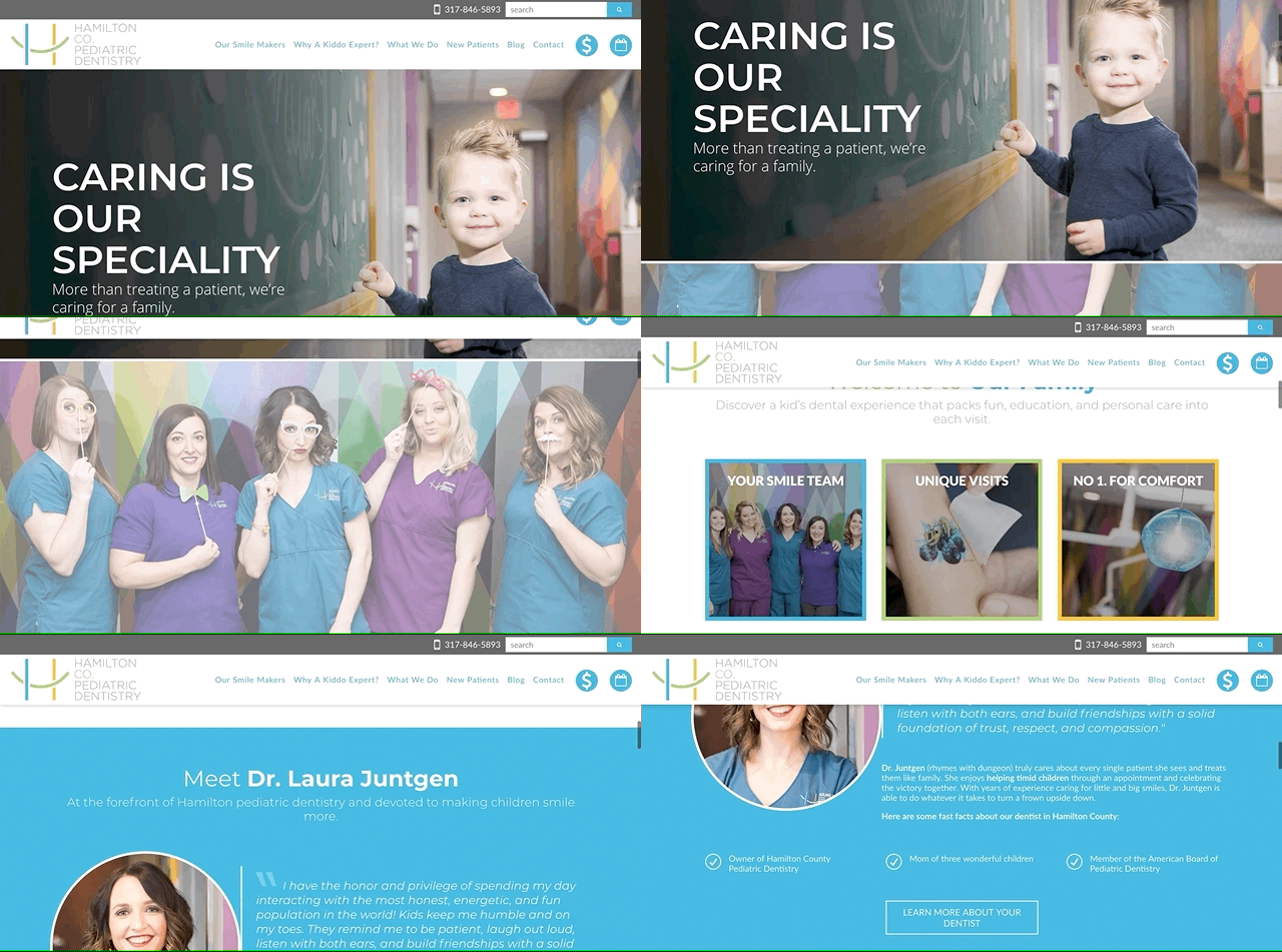
What’s the first thing you think of when you see this “actual patient” little guy?
If you’re like the many mothers looking for a great pediatric dentist (often the medical decision makers), you immediately fall in love with this practice. The gentle colors coupled with actual photography take this website to the next level.
In just one A/B test, using real person photography resulted in 102.5% increase in sales conversions!
Could your practice benefit from over a 100% increase in new patients? Here’s what our wonderfully talented Charlie had to say about it:

“Stock images just don’t cut it anymore; people expect authenticity and this provides you with an amazing opportunity to build trust and expand your patient base.”
15. Improve user experience by improving typography
For my final design trick I wanted to cover something many people may not think twice about:
Typography.
Well, more importantly, the negative effects of bad typography.
For anyone wondering what typography is…
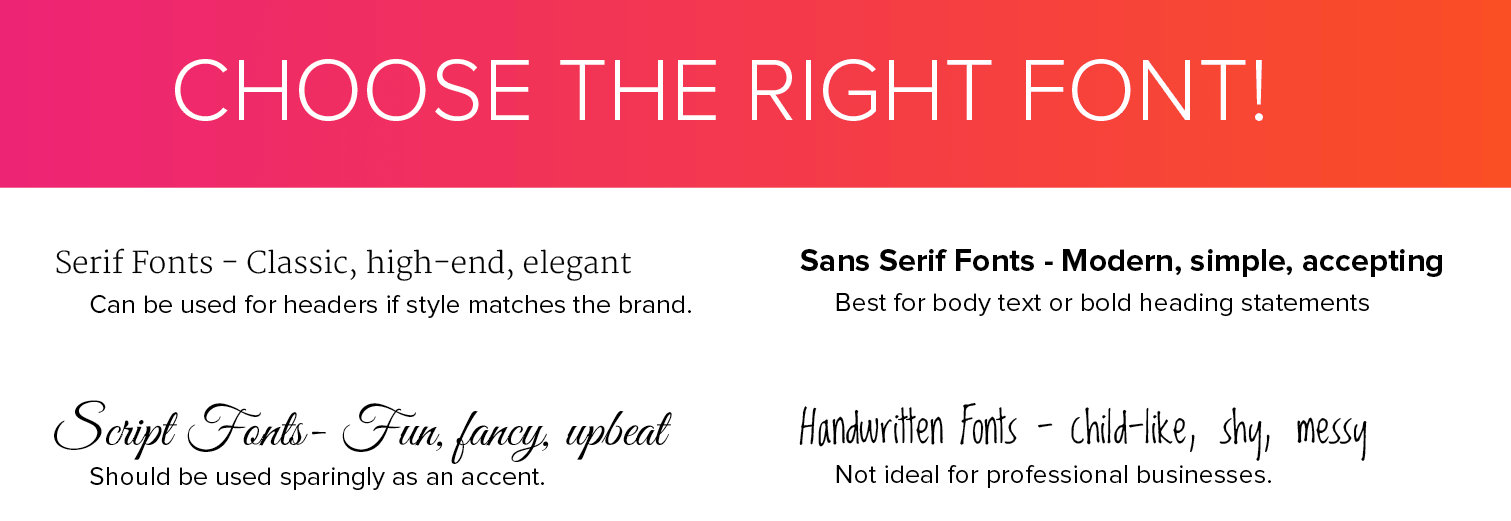
I specifically mean fonts, and everything about them:
- Font size
- Font type
- Style
- Line height
- Brand consistency
- Font weight
All of it.

You may not think of typography as a very important (or exciting) topic; however, you would be mistaken to ignore it.

The wrong font size causes your visitors to struggle reading and gives an awful user experience. The wrong font type or style could immediately give the wrong impression.
Ready to see some actual dental web design case studies?
You may have read the title and thought it was a typo. I can hear you saying “150% increase? Really…? Yeah, right…”
Does 150% percent seem too good to be true?
Let me prove it…
Let’s take a look at five practices who decided it was time to invest in great website design. Even better, let’s see how that investment turned out for them (and continues to in 2019).
Make no mistake, these practices don’t receive these awesome results by chance. They work hard to run amazing businesses and they made sure their website design reflected that. What was the result? Take a look…
Aesthetica Contemporary Dentistry gets 90+ new patients (each month)
First up we have the amazing Aesthetica Contemporary Dentistry, a Seattle-based family dental practice whose website is one of my favorites. Before Aesthetica redesigned and launched their new website, they were getting around 40 new patients a month.
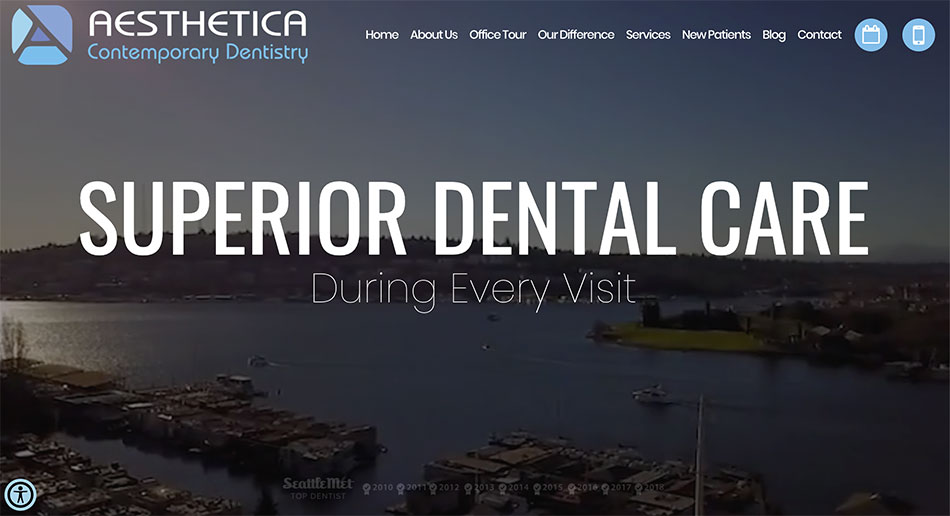
What about after the redesign? After the launch of their website, Aesthetica received (and continues to receive) anywhere from 90-100 new patients per month!
That’s a 150% increase in new patient bookings.
Of course, we can’t pretend like their website is the ONLY reason they saw such improvement. No doubt, there are other factors at play (like their hard-working team), however, did the redesign make a world of a difference?
There is no doubt!
Still not convinced design matters? Here’s another great case study:
Manchester Advanced Dental averages 60+ new patients a month (in their first year)
What makes Manchester Advanced Dental’s case study so unique is its time frame. As with many startups, getting started can be difficult and simply takes time. Which is why I am even more proud to share Dr. Yadani’s outstanding results.
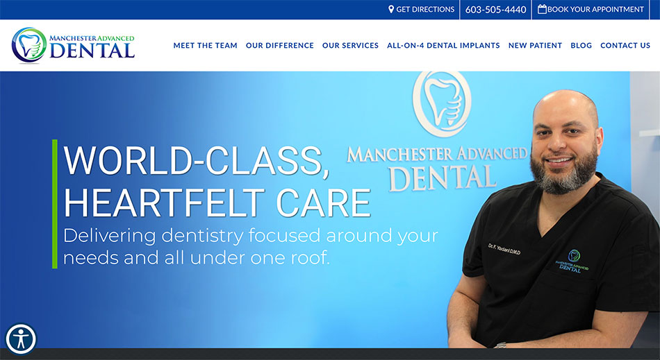
Within the first year of business, Manchester Advanced Dental is able to average 60+ new patient bookings a month!
These results not only speak to his beautifully designed website, but also to Dr. Yadani as a dentist. His profound expertise combined with his commitment to patient care makes him a no-brainer for many Manchester residents.
Great job, Dr. Yadani!
Jeannine E Wyke, DMD sees a 30%+ increase in bookings
Pediatric dentist Dr. Wyke made a goal to achieve 50 new patients a month. Before her website project started, she was receiving around 40 new patients a month.
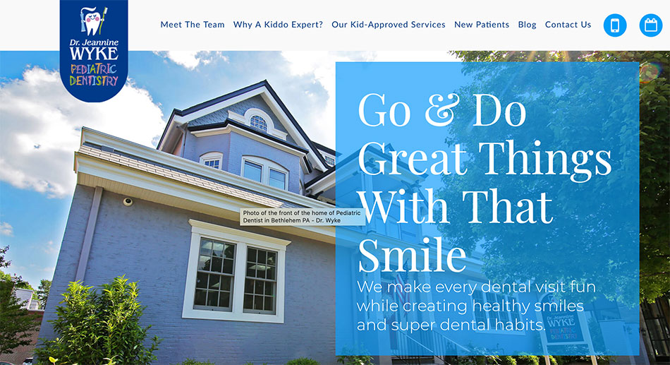
Once her pediatric practice was showcased the way it deserved to be, she not only achieved her goal but regularly exceeds it! Dr. Wyke is thrilled with her website, but she is even more thrilled with her goals being exceeded on a monthly basis.
Silberman Dental Group’s BIG problem that they LOVE having!
Maryland-based dental practice Silberman Dental Group has an exceptional team that had one major problem after the launch of their new dental website.
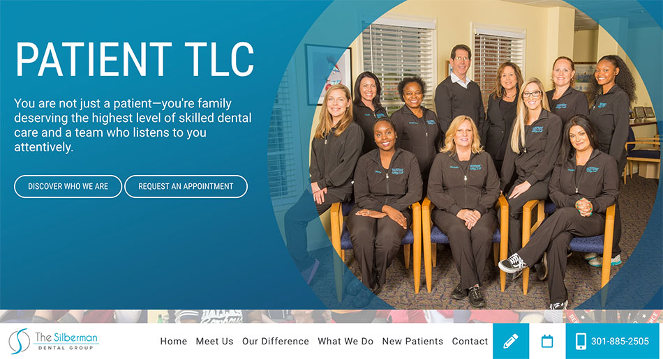
They couldn’t keep up with the phone calls!
This may sound like an exaggeration, but those were the very words echoed by their amazing front office when we asked them just how well their website has been performing.
If you’d like to see a little more about Silberman Dental Group and their website project, see their full case study here.
Orthodontic Specialists – Indian Valley receives over 30+ new patients each month (as a specialist) in their first year
Last but certainly not least is our dear friend Dr. Justin Silvestre of Orthodontic Specialists – Indian Valley. His case study is outstanding for two reasons:
- Dr. Justin Silvestre runs a specialist practice.
- His practice has been running for just a little over a year.
For these two reasons, his ability to regularly achieve 30+ new patients each month is not only commendable, but it is also impressive!
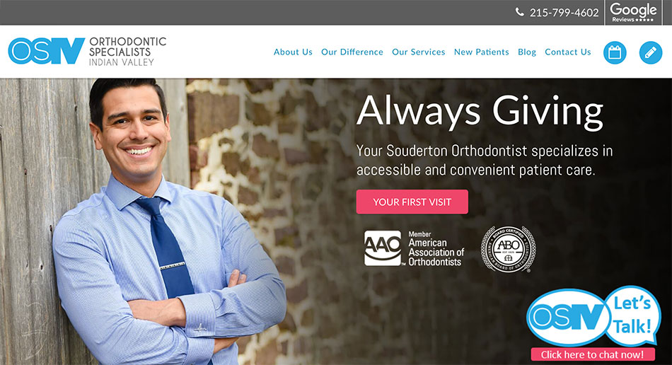
I am thrilled to share Dr. Silvestre’s outstanding results with you and I encourage you to take a look at his website and tell me why you think it does so well.
In conclusion:
The days of simply having a website for your dental practice are far gone. Today, it’s not only a requirement to have one, but also to make it amazing.
Patients will quickly connect with your brand, your mission, and the transparency of your practice.
Following the design tricks mentioned above will build trust, improve conversions, and book more patients.
Also, for the exclusive readers of this article, we are offering a free website strategy phone call, where we will happily discuss some clear improvements you can make to your website to book more patients.
Does your website need some direction? Does it need a redesign?
Get in touch to see how we can help you.
Did I miss anything?
I would love to hear from you:
What is your favorite design tip? Or maybe I didn’t even mention your favorite. Either way, let me know by leaving a comment below right now.


